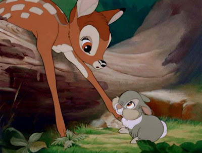
-->Bambi 1942 One of my favorites....which I'll talk about later. Tyrus Wong you're the man! Color use here is phenomenal. At start, color is employed softly, as muted hues. Very low chroma, lots of middle to middle-high values. It's soft and gentle in this case. There are colors present but they are subtle.

 Bambi is given a tour of the forest by Thumper. Both stand out due to high contrast in color: Bambi is orange and stands out due to ge rich greens of the forest, Thumper is cooler grey and stands out due to the warm orange wood behind him.
 In the meadow and Bambi's first meeting of the Prince of the Forest. Color gets toned down again to a comfortable level reminiscent of the film's beginnings. Strong greens show spring's richness
 Winter, food is scarce so greens are pulled out and blues are pushed to say cold. But a calmness is still prevalent.
 Spring: color is brought back again like the beginning. Not saturated, but gentle.
 Mother! Mother! Bambi loses his mom to the hunter(s). Dark values, lots of low chroma blues, muted opposing colors in the shadows.
 Bambi fights for Faline. Now the colors are intense, almost over saturated. Graphic black and lack of detail heightens the violent drama and obscures the characters so much we are left wondering who will come out the victor.
 Bambi is reunited with Faline, as the victor (spoiler) the colors lean toward gold.
 But the feeling is short lived as the forest catches fire through man's carelessness. Colors are presented almost separately, no blending, a near posterization. Now the forest is a dangerous place where nothing can blend of live. By the way, Bambi gets shot in this sequence, nobody seems to remember it but a gun shot rings out, Bambi is seen laying in a pool of water and the Prince of the Forest says, "Get up Bambi, Get up!"

1 comment:
I think its time for someone else to update their blog!
-Heath
Post a Comment