
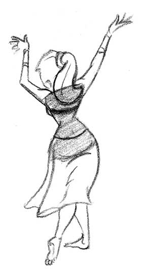
 Get that gesture in first! (That is, once you have a concept or character outline) Push the gesture so it conveys the best story. If the figure or character is tired, sad, happy, proud, angry, sneaky, timid, or feeling anything the gesture should broadcast the feeling of the drawing loud and clear. All the rest; construction, costume, value, eyelashes - is all icing.
Once you have solid gestures think about what goes into your character that sets it apart from other characters. If you have a character who is excited or moves around a lot think about how diagonals can be used to push the idea of the characters. Diagonals convey action. if your character is a villain or supposed to appear dangerous or evil, try sharp angles. These angles can make the character painful to look at; in effect suggesting teeth, thorns, shards of glass, daggers etc.
 Or another approach is to use curves. Curves act to soften a character, make it comfortable to look at, and relaxing.
 Think also about the volumes or shapes that will make up the character. Most shapes have an associated meaning and you can work those meanings into your designs. I'm sure I've said this before but the three main basic shapes are a circle (sphere also cylinder), square (cube), and triangle (pyramid or cone).
 Each has it's own set of meanings and you can choose which of those meanings fit the design. So you don't have to look up the meanings, some are included below...
Associated meanings for Circle: unity, wholeness, infinity, calm, purity, happiness, sun even moving into goddess/female power or spirit.
Associated meanings for Square: Strength, durability, solidity, honesty, fairness or justness, firmness, immobility, anger moving into masculinity etc.
Associated meanings for Triangle: Illumination, angular, action, tension, discomfort, proportion, order and (depending which way you draw it - pointing up or down) male or female.
ORRRR you could just use these shapes because they best convey what you want to show in the character.

Santa using a sphere...you know, because he has a round belly that shakes when he laughs like a-well you know.

A crusty sea captain as made from a cube.

An old feller based off of three main triangles and other minor triangles.
Don't limit yourself to just simple shapes in your design either. There is a wealth of shapes that can push the visual idea of your character as long as they follow the gesture. Below are an oval, bean, pear, rounded cube thingy, and a hour glass. Look up the meanings of these shapes, I can't tell you everything. (Yeesh)


Cat using bean shape for the torso. Play around with the curve of the bean or think about types of beans...lima? kidney? vanilla? Whatever works.

The pear bodied disgruntled spear wielding fat guy, everybody needs one. If you look at bears, they are basically pear shaped...go ahead I'll wait...also raccoons, rabbits, pears (incredible, I know) and other stuff. If the larger part is at the bottom of the character as shown above, it will feel heavier or fatter. If you invert it, the character will feel stronger or more imposing.
Hour glasses make drawing females easy but can be cliche. Control your volumes, try triangles as well.

Variations of shapes and size of shapes. Don't be afraid to play around with proportions as well. Who says you can't have a character with a huge torso and tiny legs? Or long legs and a tiny torso? Also placement of appendages are up to you; the head doesn't always rest at the top of the neck. Removing the neck and dropping the head between the shoulders makes the character look really strong. reduce the size of the forehead and you'll make your character appear less intelligent or, dare I say, dumb. Doing both and you have, well, me. "Whatever it takes to bake those cakes" as they say.
 Use whatever is in front of you to best convey your character's attitude. Look at the difference achieved in the two drawings of the same pose above just by making the back straight on one and curved on the other. Push what you know and exaggerate. Have fun drawing!


