Saturday, September 15, 2007

Two Eagles

So here's the other. I guess I should have altered the eagle foreground image of the new version back to the low angle with the fish in its talons but this is getting in to too much a of a good thing, er thing. I liked the flavor so much I had to go back for seconds and now I think I just ate too much. I have to push this dish away and get on something else. Which do you like?


By the way, sorry for sounding all elitist with the brush comment in the previous post. There are better artists than myself who use brushes and do it well. I just hate it when folks use pre-mades as crutches or excuses; Wyeth didn't have pre-mades. Anyway...there you go.

Friday, September 14, 2007

Eagle version one


...And here's version one in finish. I liked the mountains and the trees took a little longer than I would have liked. I suppose I could have used the "tree" brush from Painter to make my trees as many folks do now-a-days but what does that say about me an artist? I don't know what my daughter thinks about it now, she's off to nite-nite. Anyway, I hope you like it. Version two should be on its way soon.
Stay tuned for an upcoming challenge in later posts; seeing as October is coming and all.

Thursday, September 13, 2007

Eagle Progress...

Drawing set to multiply, ground to a mid range sepia-ish, the outer frame will be clipped off in press. This 'brown' will ultimately get painted over but bits of it will show though and it gives an "earthy" kind of feel.
Ruff in some color for the frame. This is fun, I love to mess with color and this sort of thing is just like real pastels...without the multicolored snot when I blow my nose later. Some people like that I suppose.
Blue sky here. The sepia sky is coming, but I wanted to get this version out of my head. 'Beak is making progress here, starting to feel solid and believable. Even though eagles' beaks are razor sharp they are surprisingly translucent. Water is laid in at this point as well. so, how's the first bite? A little under cooked I'd say.
I had erased into the head as it was too white. So I worked back in with very light blues. Adding lavenders and violets to the pop the beak out. Oranges, magentas and yellows rim the sunlight edge. Looks like and eagle, or at least a bird. I know because I asked my daughter and she said, "it's a white birdie". So there.
Trees, mountains and reflections, oh my! I was pleased with the progress of the reflection on the lake. So far the flavor is building. At this point, I start disliking what I have so far but this is tasting pretty good now. Gonna go stir and let it simmer a bit. Stay tuned.

Sunday, September 9, 2007

Color Tests

Here are some color tests fro the bald eagle. I did these really quick just to get an idea of what i wanted or where I wanted to go.

Friday, September 7, 2007

Haliaeetus leucocephalus

I have started work on an image involving bald eagles (Latin: see post title). I am going to show my whole process if you can stomach the awful thumbnails and sketches that have to happen before any cool color stuff begins. I feel the same as many artists before me, that the process of making a good image is like making a great meal. You have to go an get all of the ingredients -the thinking part, then mix, blend, stir, kneed etc.- thumbnailing, composing ruff drawing and storytelling, then bake, cook, or chill- the refined drawing with attention to value and visual impact. While the detail or color part is most enjoyable part, like getting to sample your meal or sneek some desert.
The whole process should be fun, and yeah, like a lot of people I can't wait to get a taste of the good stuff so I find I skip important steps in the "cooking" process. But when you stay in the kitchen and keep serious about the "dish" it makes the tasting even more enjoyable.
Here are some first steps in the process. Again this first stage of the cooking process is a bit unappetizing, but I 'm going to hope you enjoy the meal when it's done...Some of the first sketchbook stuff
getting a bit more refinedNow I remember what eagles look like...good thing they have some at the SFzoo. The thumb at the top right is the one I chose to go with.Getting there...(the pot's starting to simmer)A final sketch. Ready for the first taste. Stay tuned.

Thursday, September 6, 2007

It pays to shop around

So we bought a new car last weekend. Those of you who know me, will join me in mouning the passing of a good truck which we traded in to get this 'zoom zoom' cool family mini-wagon-van 6 seater known as the Mazda5. It holds kids and stuff, and a big fat guy like me too. It's fun to drive and handles well. I dig the color too, although I haven't figured out what it's color number is yet, give me a little while.
We got it below invoice because my wife is a super awesome car shopper/haggler chica. When we got a reasonable price originally, I was willing to take it (I'm weak) but not Lynette. No, she said she wanted to shop around and still see if anybody else could give a better price, the dealer had a hard time letting us out of the store. She even called other dealerships the next day and sort of set up a bidding war via the phone. Finally we settled on great price that never would have happened if it had been up to me. Big props to my wife!

As long as I have your attention, I wanted to show you some "fine art" Amara did while I was working on the computer. She's almost a photoshop wiz, if only she'd stop bashing my stylus into oblivion. She's pretty good, especially at titling her work. I think perhaps she'll be a neurosurgeon or a right winger for the Sharks later so she can support us when we retire.
2 Pancake Pancake 2 RainDrop
I know this post isn't about my work, it's more fun to show this! Stay tuned for more banter.

Monday, September 3, 2007

First Post!

Well, I finally joined the band wagon and set up a blog. These things tend to take me a long time to join, while technology rolls on ahead. We'll see how it goes from here. With hope, the work I post here will be interesting and worth your time.

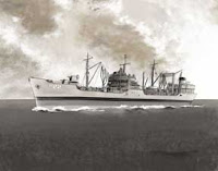
To get started I'd like to show you a breakdown progression I did recently. In later posts, I'll show stuff like this because I like the process of creating illustrations. After a series of thumbnails I came up with a final drawing, shown at right. The AO22 also known as the Cimmaron was an oiler that fueled the pacific fleet from 1939 to 1968. My dad served as a lieutenant aboard her and so I was honored to be able to draw her.

Next I went to Photoshop and started some color. I wanted a tintype kind of feel and worked reasonably monochromatically, but with minor color additions to give a nostalgic "Navy" feel. After blocking in a 'post-storm' sky I shifted to the foreground ship and laid in ruff values. Note; the number on the ship is in the right place but isn't a style that would appear on a US navy vessel.

I was satisfied with the appearance of the ship itself, but something was bothering me with the sky and water -I guess what I'd loved at the start wasn't happening anymore (the honeymoon's over) ...and I started again.

I don't know what possessed me to paint this new sky but I did. I suppose I was looking for a more stormy sky and it ended killing my lights in the clouds. My daughter saw it and refused to sit on my knee and "help" me draw because it was too scary. Even my wife saw it and hated it, asking why it was such an unhappy image. This is what you get if you think too much in the paint stage rather than the thumbnail stage.

So...I guess it really was love at first site for the sky and lighting. After a few undos (this, friends is the best thing about working digitally) we were back to a better sky and on our way to finally addressing the water. I handled water last because of all the lighting issues incurred there in. So after going back in an cleaning up and refining, I ended up with the final version you see below. Turned out alright I think. the best compliment I could get was from my dad who after a thoughtful smile turned to me and said, "It looks just like her".