

Wednesday, December 19, 2012
Monday, December 10, 2012
Quick Clean Up of Drawings
This is in no way intended to be a tutorial because there are much better ones out there with regards to cleaning up a crappy scan or worse, a bad camera phone photo of one of your drawings. This is more like a "Holy crap! Your Mom/Significant Other/Boss/Police will be over to your crib in five minutes and you have to clean/hide/burn/flush/throw out window all the junk to look attractive or normal or innocent!" kind of post about cleaning up your drawings for that final model sheet project that is due that your instructor told you to make look clean.
First, find a scanner and scan your drawings. For those of you that thought it would be good idea to use your camera phone, hand held, to take a photo of your work, on your kitchen table under one light - probably fluorescent - or on your carpet in the living room next to your cat or your shoes...here is what needs to be asked....WHAT THE HELL WERE YOU THINKING?! Are you just trying to ruin your life, or worse, MINE? Why not go and slam the car door on your fingers? At the very least it would be faster and probably less painful to fix. Ahem. If, for some reason, you lost your mind for a moment and did intend take a photo of your drawing with your camera phone, at least lay it flat and get two lights of the same wattage and place them on either side of your work and find something to steady your hand so you at least simulate a camera stand.
Anyway, what's a good way to clean up all of the shadows and junk around your drawings if you do shoot them with your camera phone in manner mentioned above?
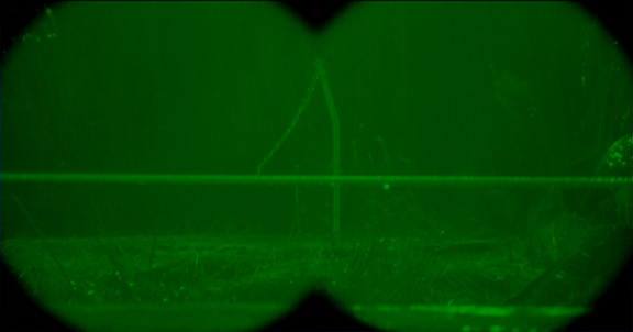
Let's start with the worst; a camera phone photo of a drawing as shot hand held on the kitchen table at 3:00 in the morning with just the kitchen light on. Result is below. Now, you could just turn this in because you are too busy to care, but your instructor is probably too busy to give you good grade if you force him/her to even look at this atrocity.
 It's a revolting yellow color, there are shadows all over the place, it's a revolting yellow color, it's out of focus, and it's a revolting yellow color. Go have a look at the above, I'll wait.
REVOLTING!! YELLOW!! COLOR!!
Because this is for a model sheet project and color isn't really a factor, first thing to do is get rid of the color.
Now, you know this, in PS (I even have used a really old version of CS5-gasp!) open your file and click Image -Grayscale and click Okay.

 Click Image - Adjustments - Levels (or hot key it) to get the Image adjustment window.
 The sliders denote black, middle gray and white. Adjust each to get rid of as much shadow as possible without blowing out your drawing. I tend to favor the gray slider.
 This is what I ended up with. Keep in mind that this is a quick fix in lieu of time, you can set up mask layers and all of that jazz, but we just want to get this out of the way so you can play another 15 hours of Skyrim.
 To speed things along I click on the marque tool and select a large portion outside the drawing to delete...
 and again on the other side...
 That's less distracting. Move on, the clock is ticking.
 Now, quickly erase out some of the extra junk on the outside you can/will erase later as a finishing touch. We are about 4-6 minutes into the process. Now, click on Filter - Sharpen - Unsharp Mask. I like this because you get a slider window and have a little more control over what you can sharpen rather than other options.
 Use the sliders to bring the image more in focus. Doing so will take away information so be sure you don't over do it and your image begins to pixelate. But note how much more clear the image below is as compared to the above.
 At this point, I want to lighten the gray stuff in the drawing itself so I marque parts, in this case, the legs and go back to Levels and use the sliders again. Selection parts allows you to alter some things without losing information in other areas. The shoulder and head are going to be a little tricky as the
shoulder is going really dark but the hand and parts of the head are
washing or blowing out as a whole. I selected the arm and cane and boost the levels accordingly.
At this point, I want to lighten the gray stuff in the drawing itself so I marque parts, in this case, the legs and go back to Levels and use the sliders again. Selection parts allows you to alter some things without losing information in other areas. The shoulder and head are going to be a little tricky as the
shoulder is going really dark but the hand and parts of the head are
washing or blowing out as a whole. I selected the arm and cane and boost the levels accordingly.


 Finally I erase out a little more of the spots and end up with the below. A perfectly acceptable 'rough' drawing without camera shadows and other filth, the whole process took under ten minutes. I understand many of you will object to the processes described in this quick demonstration but the steps mentioned above will get you a good, readable rough drawing suitable for use in project such as this where you need to show your rough keys.
 Hope that helps, have fun drawing and uh...shooting stuff with your camera phone and PLEASE don't slam your fingers in your car door.
First, find a scanner and scan your drawings. For those of you that thought it would be good idea to use your camera phone, hand held, to take a photo of your work, on your kitchen table under one light - probably fluorescent - or on your carpet in the living room next to your cat or your shoes...here is what needs to be asked....WHAT THE HELL WERE YOU THINKING?! Are you just trying to ruin your life, or worse, MINE? Why not go and slam the car door on your fingers? At the very least it would be faster and probably less painful to fix. Ahem. If, for some reason, you lost your mind for a moment and did intend take a photo of your drawing with your camera phone, at least lay it flat and get two lights of the same wattage and place them on either side of your work and find something to steady your hand so you at least simulate a camera stand.
Anyway, what's a good way to clean up all of the shadows and junk around your drawings if you do shoot them with your camera phone in manner mentioned above?
Let's start with the worst; a camera phone photo of a drawing as shot hand held on the kitchen table at 3:00 in the morning with just the kitchen light on. Result is below. Now, you could just turn this in because you are too busy to care, but your instructor is probably too busy to give you good grade if you force him/her to even look at this atrocity.

REVOLTING!! YELLOW!! COLOR!!
Because this is for a model sheet project and color isn't really a factor, first thing to do is get rid of the color.
Now, you know this, in PS (I even have used a really old version of CS5-gasp!) open your file and click Image -Grayscale and click Okay.

You will now have the below. Granted, it still looks terrible but at least that revolting yellow color is gone. Okay let's take away this gray.


Same with the legs as shown below.

The head/face and arm is really being a pain here so I select the whole group and go back to Unsharp Mask and after a little adjustment, I get it to a manageable value and sharpness.


Friday, November 16, 2012
Gesture Stays The Same!
Sitting in class, discussing with students their characters' turnarounds. I am amazed that so many of them have changed the dynamic poses they came up with because, "the pose was too hard to draw". The gesture is the soul of the drawing! Everything else; construction, anatomy and technique just get added to or built off the gesture. One word: Blah! If you redraw the pose into something "easier", you are actually dulling it down, like striping out the melody of a song, the flavor out of a sauce, or the personality out of a good friend. A new "less complicated" version is just noise, tasteless glop or detestably uninteresting. There is way too much of this watering down going on now-a-days so the challenge is to CHALLENGE yourself by coming up with gestures that are not only lively but but push the essence of the pose you are trying to draw. Doing so will push the limits of drawing ability as well. If the character/figure you are hoping to convey has a solid gesture, The specific shapes you use in construction should "fit" the gesture. If the character's legs are very long, then those leg cylinders should be drawn long, but still reflect the gesture they are trying to express. There may be a need to draw a new line or elongate the gesture but this new "complimentary" gesture line needs to be at the same angle(s) and expressiveness as the original gesture. Think of starting any pose a character who has unusual proportions by drawing the gesture of 'typical' human. Do not get caught up in the length of the legs or thickness of the chest etc. Just draw an expressive gesture and add the components of construction to it. If it helps, draw the pose using standard human expression and proportions first to give you an idea of what the pose looks like before you try to draw the character's actual proportions. This will free you from over-thinking your character's pose. After drawing some poses of your character this way, you will get to the point where you can draw out your character with good gestures according to to its unique proportions. Here is a quick GCA breakdown in three steps. A lot of compression is happening in the abdominals as well as a twist through to the shoulders.

I have taken three characters from my students (I don't really remember how they look but made some estimates) one has very long limbs -the character not the student-, one is very thick through the neck with long ears and the last is um, well fed. I used the same gesture (shown in red) from the above drawing to pose each one.

In each case I have had to 'push' the construction off the original gesture but those shapes follow the original gesture. You can add just any constructed form on an expressive gesture, don't cheapen the work you do because it's hard to draw. As always, you can click on the images for a larger version. Now go draw difficult poses, thanks for stopping by.
Sunday, September 23, 2012
Interview'd AGAIN.
I know what you're thinking, "Gee-ood, did they run out of interesting people?!" Apparently, yes. Anyway this is a rough draft from Rochelle Beckel, journalism student at SJSU, who came into my class looking to interview an instructor who could loose his/her job if Prop 30 doesn't pass.
She interviewed a group of my students and then myself. Here it is, thanks to Rochelle for giving premission to post this.


She interviewed a group of my students and then myself. Here it is, thanks to Rochelle for giving premission to post this.
Rochelle Beckel
Journalism 132C
9/19/12
9/19/12
Prop 30 Personality
Profile on Jeffrey Jackson
The minute I walk into Jeffrey
Jackson’s animation/illustration fundamentals class and hear him talk, I am
instantly at ease.
“It’s Cooooourtney!” Jackson announces dramatically as Courtney Granner, one of his colleagues, introduces me to the class and explains that I will be sitting in on the class and interviewing some of the students about Jackson.
“It’s Cooooourtney!” Jackson announces dramatically as Courtney Granner, one of his colleagues, introduces me to the class and explains that I will be sitting in on the class and interviewing some of the students about Jackson.
It doesn’t take more than 30
seconds of sitting in the back of the full classroom to realize that Jackson is
far from the stereotypical intimidating, impossible to relate to, dull college
lecturer that so many students envision their lecturers to be upon beginning
their journey into college classes.
“He’s really funny and he jokes around all the time, and he
makes learning things seem really simple and there’s not much pressure,” says
Olivia Keller, a sophomore animation/illustration major.
After explaining that without Prop
30 passing, Jackson’s career as a lecturer at SJSU would likely be at risk,
several students expressed their concern and adamancy that Jackson in no way
deserved such a consequence.
“It’s not fair because he does just as much work, if not
more, than the other professors here and in other departments,” Keller said.
“He stays here for a long time, he has office hours here, he spends more time
individually with each student because class sizes are smaller. He really goes
to your personal needs, you know if you have personal questions, it’s a lot
easier for us to get in contact with him.”
Keller isn’t Jackson’s only student
who appreciates his informal, relaxed attitude toward the class. “He’s very
down to Earth and he makes you feel comfortable, like no matter what you say
you can’t be wrong,” adds Emily Wheeler, a sophomore animation/illustrator
major. “He always tells us it’s your own interpretation, everyone has their own
interpretation. The school would be losing a really good teacher, a really good teacher. He founded the
Shrunken Head Man Club and I mean that’s what this whole program is based off
of, that’s how we’ve grown as a major and stuff.”
The
Shrunken Head Man Club started out as a small organization with about 15
members that even gave out free gum to encourage people to join. Now, it has
grown to hold 570 members and fills up an entire lecture room in Washington
Square Hall. The club discusses upcoming events relating to their field, has
guest speakers give presentations, and holds conversations among themselves
regarding the myriad of issues they all have to face as students of the art
department such as unit caps. Jackson was chosen to be president of the club
and is very proud to be known as one of its founding members.
“It’s like this huge family,”
Jackson explains. “It’s competition, but it’s friendly competition. Nobody’s
coming in to stab you in the back or anything like that.”
Jackson has been a part time
lecturer at SJSU for the animation and illustration program since spring 2011,
something that has been a longtime dream of his because for him, it meant
coming back to teach at his alma mater. A member of SJSU’s 1997 graduating
class, he explains one of the ways his experience with college classes and
professors influenced his teaching style, but not in the way you might not
think.
“I know that there were classes I took at San Jose State
where it was like ‘This is how you do it, do what I’m telling you to do and do
it my way,’” Jackson explains. “So I try and incorporate some fun, I try and
let the students laugh and enjoy themselves but at the same time kind of figure
out for themselves what’s working and try and give them a set of different
ideas to bounce off of.”
That laid back, relaxed environment
that Jackson naturally promotes is evident in the students’ responses to the
kind of class he leads every week and a key aspect of why they are so drawn to
his lessons and teaching style. Even his office hours are informal; instead of
holding them in an actual office, he chooses to have them right in his
classroom after the class session ends to help ease the anxiety that some
students may have before approaching a teacher for some one on one assistance.
“The
environment he provides, you learn something but it’s very relaxed so you don’t
feel intimidated to ask questions,” says Josh Gong, a sophomore majoring in
animation/illustration. “You’re always going to have a fun time, but while
learning something. He always gets involved with the students, he helps you
personally if you just ask him questions and he’ll do the best he can to help
you out, and most of the time he’s very helpful.”
“He’s just really funny and really upbeat and he always
keeps you involved with the class, you don’t really get lost in it,” adds Saul
Uribe, a sophomore animation/illustration major. “You’re always interested in
what he’s saying because he keeps the jokes coming and all that. Even though
he’s funny and cracks jokes all the time, when he gets to the actual teaching
he’s very serious, he gets into it then he explains and there’s no jokes in
there, then he goes back to going funny again.”
Jackson’s
teaching experience isn’t limited to just SJSU—he has taught classes at several
schools in the past but is currently on his 13th year teaching at
Cogswell Polytechnical College in Sunnyvale in addition to lecturing part time
at SJSU. Cogswell is where his teaching career took off after starting out as a
supervising animator for the school’s internship program. However, even after
the internship program ended he continued to work on animation there with
students. He had no idea that eventually, the school’s dean would be asking him
if he would be interested in working as an animation teacher for the school.
“It turned out to be like ‘Well in three days, classes start
so make sure you sign right here!’” Jackson recalls. “So then I signed, and I
thought ‘Ok, well it will be good just for a semester,’ and then after that I
was like ‘Wow this is great, I love this’ and so here I am.”
He explains that he believes that
what makes a great teacher is someone who really knows the subject that they’re
teaching, but at the same time understands the student mind and can explain
their subject’s material in a manner that the student can genuinely comprehend.
“I really like being able to see
students learning, I think that’s really cool,” says Jackson. “If I can get up
in front of an audience of students and they can actually take away some crazy
thing that I’ve said and turn it into something they can use as a tool, I think
that’s the finest feeling.”
Courtney Granner, a professor of
the animation/illustration department and colleague of Jackson, agrees with
Jackson’s students that Jackson is an irreplaceable member of the art
department community. “I think he understands our culture and how we
communicate with our students, and I think he understands that it takes an
amazing amount of dedication for the students to succeed. He knows that
everyone is an adult and he gives them that respect, but manages to keep things
light and lively at the same time,” Granner says. “Jeff’s an outstanding
personality, he’s a real colleague, he stepped right in and was able to do the
right thing right off the bat. He knows, and he’s a good fit for us.”


There you have it. So, two things: DON'T Call me Jeffrey even if you do see it in print and vote YES on prop 30. Thanks again to Rochelle for interviewing me.
Monday, August 27, 2012

Tuesday, July 3, 2012
Ocean Waves
Commissioned to do a peice "about the ocean, you know" So I chose to paint a part of the ocean that I love, the Monterey Bay. Standard process started with thumbnails of course.
Then, moved on to paint. Here, I am just laying in the colors of the water and giving attention to the rocks and the splash. The image boarders are taped off with removable tape.
 Below, waves are almost done as are BG colors.
 Next, foreground elements. In this case it's Coastal Cypress. It when a little south on me here and am not really happy with the result but deadlines are deadlines.
 Here is the final. Image size is 11X14" I enjoyed doing this and despite having too much other stuff to do, I got to use my pastels again after a long hiatus. MAN, I LOVE CHALK PASTELS. Take that, stupid computer. More of these to come. Perhaps I'll try to do these while at office hours. Which will make me a happier person to talk to and cover everyone's stuff with layers of very fine chalk dust.
 Here is a detail of the rocks, in case you are interested.
 Want one? Let me know. Thanks for stopping by.
Then, moved on to paint. Here, I am just laying in the colors of the water and giving attention to the rocks and the splash. The image boarders are taped off with removable tape.


Thursday, May 17, 2012

Tuesday, May 8, 2012
Continuity: Jurassic Park


Okay, so let's review the scene, but before we do, we have to go back a little in the movie, a few hours earlier, when the tour starts and finally the group comes to the T-Rex paddock. After the big animal doesn't show up (which is a great moment because the whole audience cranes their necks to see the T-Rex just like the cast does) they try to entice it to come out by "offering up" a goat. Note goat. He's just standing there. This will be important later.


The film makers needed to get Alan and the kids out of the way so they couldn't be found when Ellie and Muldoon come back to find Ian. So the sudden insertion of a cliff becomes totally necessary to move the story along and very few people even noticed due to all the action and the duration of the T-Rex attack. So, is this sort of continuity bad? Not at all. Sometimes the story needs a push, and if the audience as a whole doesn't notice, then do it! If you need place a light source in a weird place in your illustration or film so the action is easier to read, do it. If you need to do something out of the ordinary or even beyond the limits of reality to boost your story, and you can get away with it, do it. Maybe in 20 years somebody will write a blog post about that decision. If you are able to keep the audience focused on what you want them too, you can get away with almost anything. Don't believe me? Check out this link and be amazed. Go to this IMDB link for more info about Jurassic Park. If you'd like to see a complete set of storyboards from the film, I recommend this book. Now go back and watch this film. I also love the kitchen scene but can't help rooting for any and all of the dinosaurs, especially when it comes to eating those annoying kids. Thanks for stopping by.
Thursday, May 3, 2012
I don't know why...
...But I was sitting in front of the computer, my son walked over and asked me what I was doing and all of a sudden these images opened in Photoshop. I don't remember clicking or selecting these old drawings, but I figured there must be some sort of voodoo thing going on here causing drawings from long ago to suddenly open and I decided to post them here. If redundant, sorry.


Wednesday, April 4, 2012

Tuesday, April 3, 2012
Leaf Test: Getting Started...
Use your field guide to setup you lay out. Because this is just an animation test, you don't need a spectacular BG just a well composed and staged space to allow you leaf to move about and not get lost in the background details. BG is one layer and in this case just one held frame.
 To make animating a little easier, plot out your arc path. Below is a very simple path from branch to ground. Notice how the action has been staged so the motion is readable throughout the piece. Enough of the ground plane has been left open for action. Do not allow your leaf to sit, land, or touch the bottom edge of the frame.
Next, using the arc path you just drew, tick off points where you think the leave will appear on the arcs. The closer together the drawings, the slower the action, while faster action requires more spacing between drawings. As gravity pulls the leaf, it slices through the air moving quickly. Denser air or wind or other factors will slow the leaf causing it to change direction-more drawings here. Once gravity takes over again and the leaf again slices through the air it will pick up speed and slow at another change of direction etc. When landing the leaf moves the slowest and finally slows out to a stop. Lots of drawings here. Now you're ready to test it. I think you will find that the randomness of the tick marks will be corrected when you test your work and the path begins to feel right.
 Most of the arcs will be created by air current and position of stem. Remember also that the fresher a leaf is the more pliable it is. Meaning that it it will bend and roll as it moves along it's path to the ground. The more dry a leaf, the less flexible it is. But this is all relative, if the leaf doesn't bend or roll it will look really stiff on it's way down. Larger leaves 'float' better while smaller/thinner leaves tend to 'tumble'. What kind of leaf are you using?
  Have fun animating!
 To make animating a little easier, plot out your arc path. Below is a very simple path from branch to ground. Notice how the action has been staged so the motion is readable throughout the piece. Enough of the ground plane has been left open for action. Do not allow your leaf to sit, land, or touch the bottom edge of the frame.
Next, using the arc path you just drew, tick off points where you think the leave will appear on the arcs. The closer together the drawings, the slower the action, while faster action requires more spacing between drawings. As gravity pulls the leaf, it slices through the air moving quickly. Denser air or wind or other factors will slow the leaf causing it to change direction-more drawings here. Once gravity takes over again and the leaf again slices through the air it will pick up speed and slow at another change of direction etc. When landing the leaf moves the slowest and finally slows out to a stop. Lots of drawings here.
 Now you're ready to test it. I think you will find that the randomness of the tick marks will be corrected when you test your work and the path begins to feel right.
 Most of the arcs will be created by air current and position of stem. Remember also that the fresher a leaf is the more pliable it is. Meaning that it it will bend and roll as it moves along it's path to the ground. The more dry a leaf, the less flexible it is. But this is all relative, if the leaf doesn't bend or roll it will look really stiff on it's way down. Larger leaves 'float' better while smaller/thinner leaves tend to 'tumble'. What kind of leaf are you using?
  Have fun animating!
Subscribe to:
Posts (Atom)