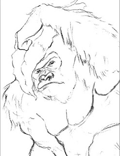
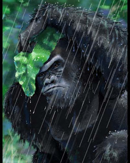
If you don’t know Cesar, he’s a product of Cogswell College and just an awesome animator, he instantly earned my respect after just working with him for a few days. He is working mostly with Flash as of late and seems to be doing well with it. I remember him always going on and on about gorillas so I thought I’d post a gorilla progression I did in PS a while back. I blasted it out too quickly and was happy with the results at first but now that it’s had a chance to settle in, I feel like I need to go back and work on it more. Let me know what you think.
The Sketch
Background and Color Comp


6 comments:
Thats a great Illustration Jeff. I love the expression on his face and the detail in it.
Thanks Mr. M.
I don't understand what you don't like about this Jeff. I think it looks great. If I ever think of something more helpful to critique about it I'll let you know.
I like the final comp, especially the face and rain. the leaf tho feels a bit flat near the grip of the leaf. my only other crit is that he feels compressed towards the right arm leading down.
This is very awesome!
For the critique, I agree with Mike S. There's something about the arms. The anatomy is correct (of course) as well as the perspective. But I think it's the aesthetic appeal that might be throwing you off Jeff. It's the gorilla's silhouette, like the posing just needs to be pushed into a more clearer read. But this honestly is very minor.
--Big C
i dig it!
Post a Comment